

Optum Now Account Enhancements
Optum Now is a digital health platform empowering individuals to take control of their health with ease and confidence.
-
Optum Now user authentication, medication orders, visit details, shop orders, and care team are scattered across four different databases and they are accessible from four different frontend experiences as well.
This leads to user confusion with how and where to access information that is critical to their unified care journey. This also leads to duplicative accounts being created in each ecosystem that belong to the same user.
For these reasons our team was tasked to consolidate the front and backend of these databases as well as add additional features (ex. add a new family member and account to-do list.)
-
I led by reaching out to individual stakeholders 1:1 after our initial kickoff with the broader team. The goal was to build rapport with new team members, flesh out glaring limitations, and socialize potential directions we could start to consider based on some quick examples from competitors.
After connecting individually, I began designing an experience for our enhancement launch that would be scalable for the future as well. We were given full freedom to research and iterate on what we felt was the premier experience, understanding that priorities and tech limitations would be bridges to cross soon.
As the Design lead, I found myself constantly challenging the Product team to see beyond our immediate objective. I regularly rung the bell that the future state of Account would also need to house diagnostic testing, AI health chat history, and other complicated medical results. Quick, “bandaid” UX solutions would lead to (and did lead to) additional work down the road.
Luckily the rapport I built meant other stakeholders heard and understood my POV. We shared the responsibility in championing more complex Design and Engineering solutions that resulted in a more streamlined experience in some instances.
I also created a VQA document (FIG. 5) when I realized the team was pushing code without any design sign off. This document eventually grew to include the whole site and was handed off to Product for prioritization.
-
For UX and information architecture, I leaned on the Google Suite for inspiration (FIG. 1.) Their range of data categories housed under a single Account Center lent itself well to the complexity of our Account overhaul. Specifically, I looked into YouTube because one of the new items displayed within Account is an enrolled, subscription-esque program called “Guides.”
For UI I leaned on Airbnb as well as the Google Suite. I chose them because both orgs design with structure and utility in mind. And those design principles are punctuated with small moments of visual delight which I am subjectively drawn to as a designer. Similar brand pillars also exist within Optum’s brand guidelines.
-
Because this is healthcare and we interfaced with so many outside organizations, communications broke down often. In order to keep the team up to date, we shared (and reshared) designs often. I found myself modifying the same flows as new dependencies and limitations were uncovered.
All along the design process we encountered technical considerations that limited our UX. The Account frontend houses data native to our organization as well as being migrated from third-party databases (FIG. 2.1-2.2.) For this reason, certain states and annotations I proposed (ex. “delivers in 2 days” for an order) had to be deprioritized because it was not in our codebase to control.
We also had to scrap a delightful avatar selection experience (FIG. 4) that was fully designed and developed but was not able to be implemented on the backend. Unfortunately, the combination of these limitations increase cognitive load for users and led to a less scannable and delightful design solution.
-
We successfully launched the unified experience in three phases.
During the product development process I was able to create new patterns of interaction that have been adopted to areas outside Account. Pattens such as edit/input action sheets, user avatars, side navigation, setting default payment method & deliver address, and success messages.
To-date, 11% of users create an account while interacting with the site. However, this number is slightly inflated due to certain capabilities being gated by authentication.
-
Josh Bartleme (Product Manager, Medications) Drew Beamer (Frontend Engineer), Joseph Keufler (Design Manager), Brandy Hamilton (QA Engineering Manager), David Metcalf (Frontend Engineer), Thelma Okocha (Project Manager), Nate Seaman (Product Designer), Tucker Vogt (Product Manager), Bianca Wu (Product Manager, Account)
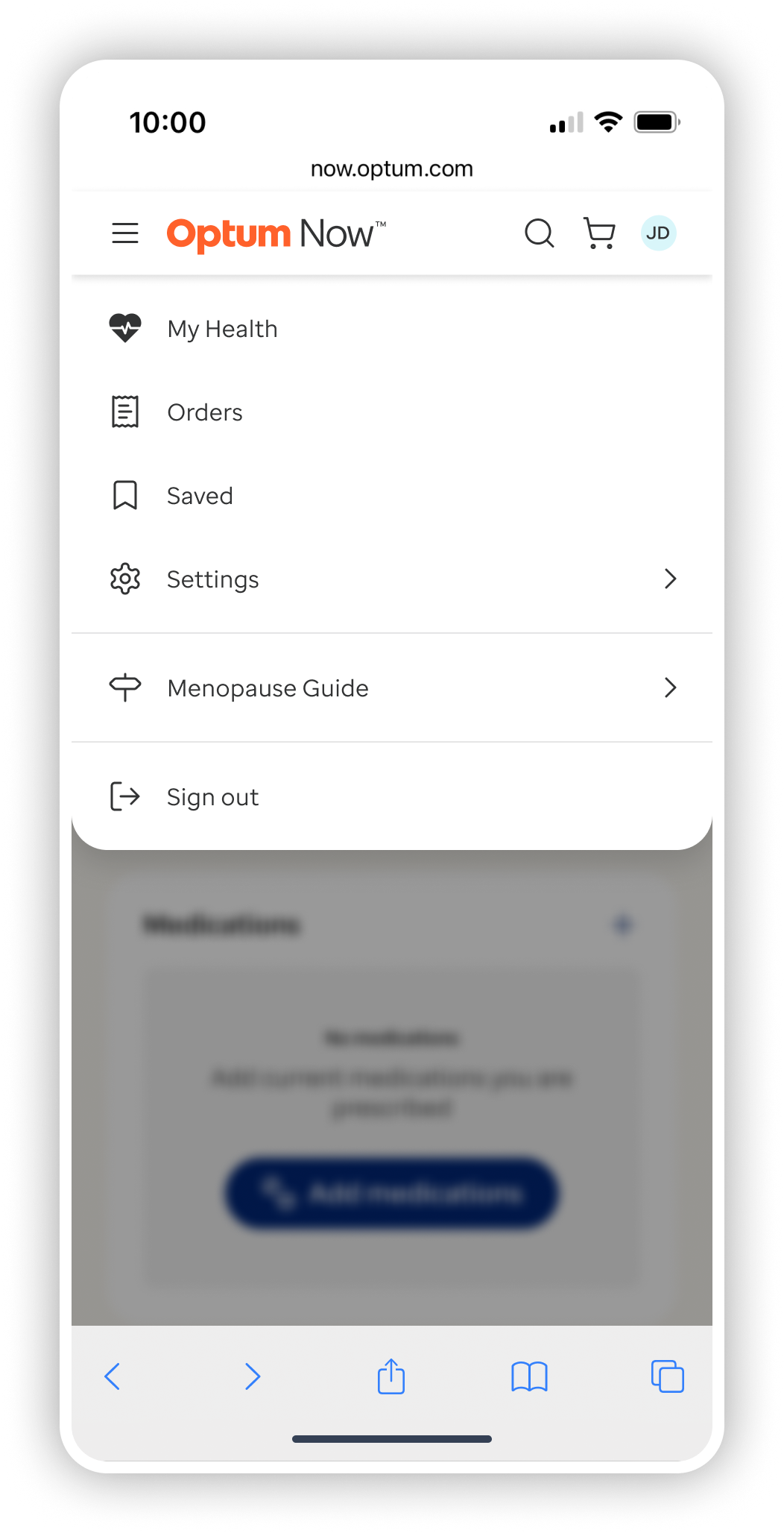
MENU & NAVIGATION
A user can access their account information, enrolled health programs (Guides), and saved content within their profile.
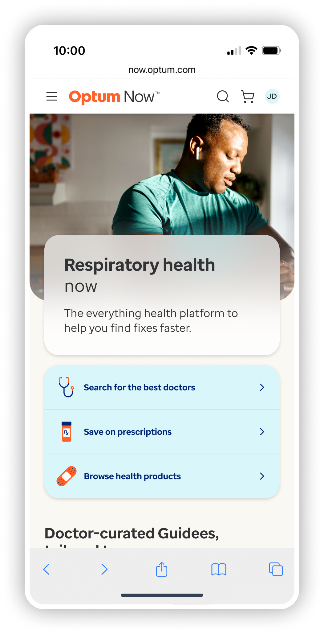


MY HEALTH
A user can access their health to-do list and treatment plans from previous visits. A user can update and modify prescription orders as well as upcoming video visits.


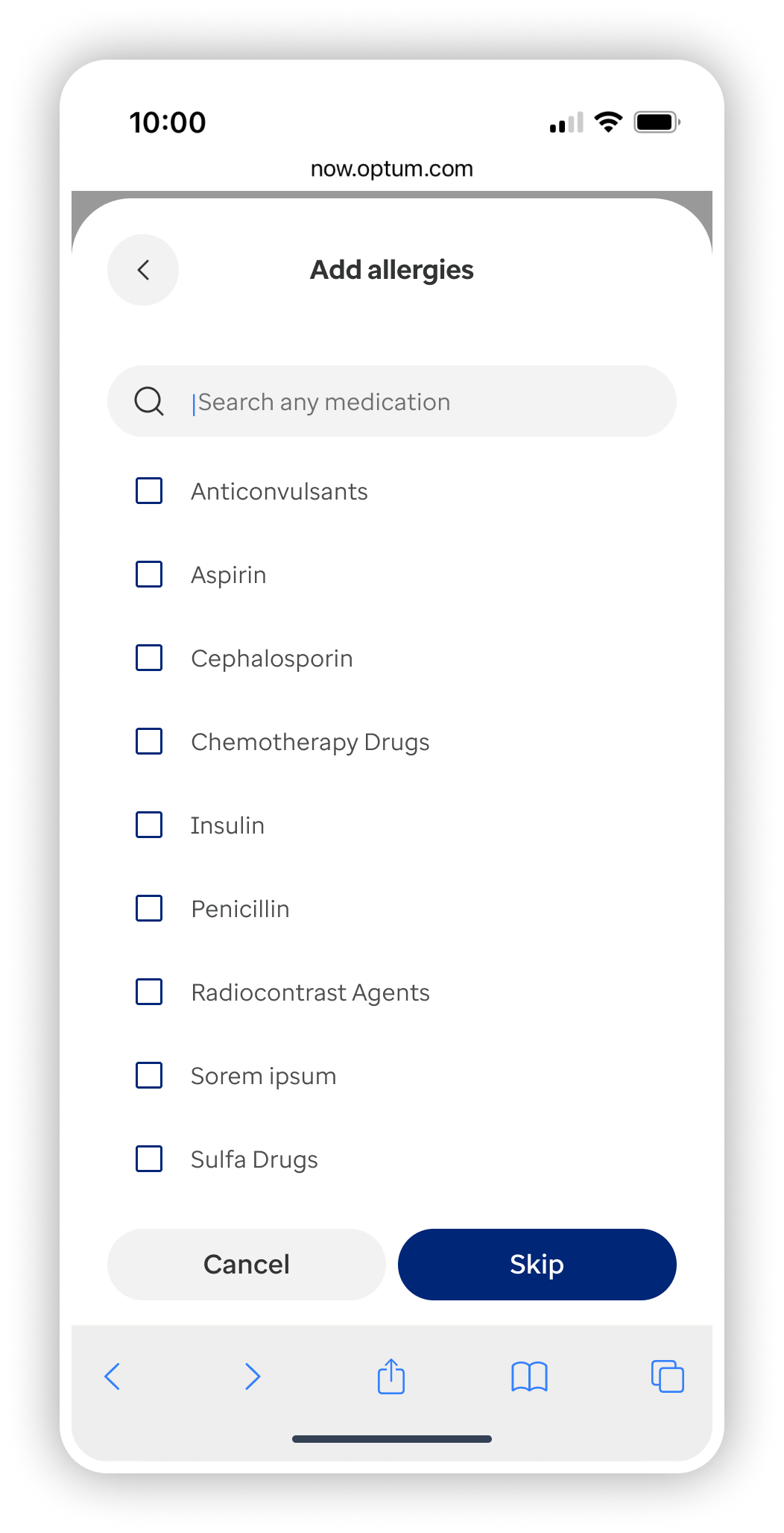
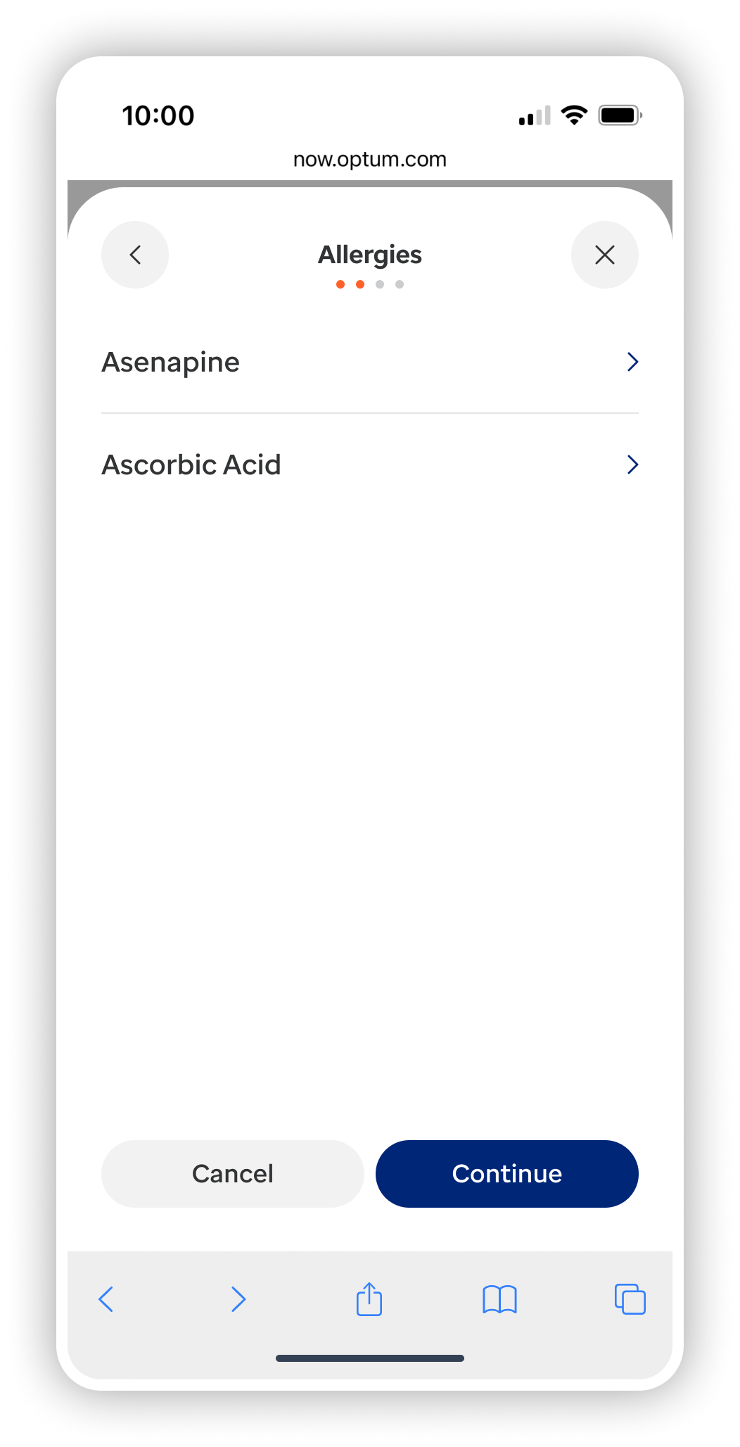
ADD A FAMILY MEMBER
A user can add dependents to their Account along with medical info like allergies and medications.


SELECT AN AVATAR (DEPRIORITIZED)
A user can select an avatar for a family member (also see Appendix FIG. 4) The image is fun, personalized, and HIPAA-compliant allowing users to quickly identify items within Account pertaining to each family member.


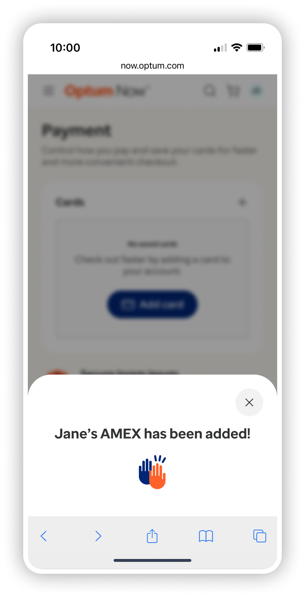
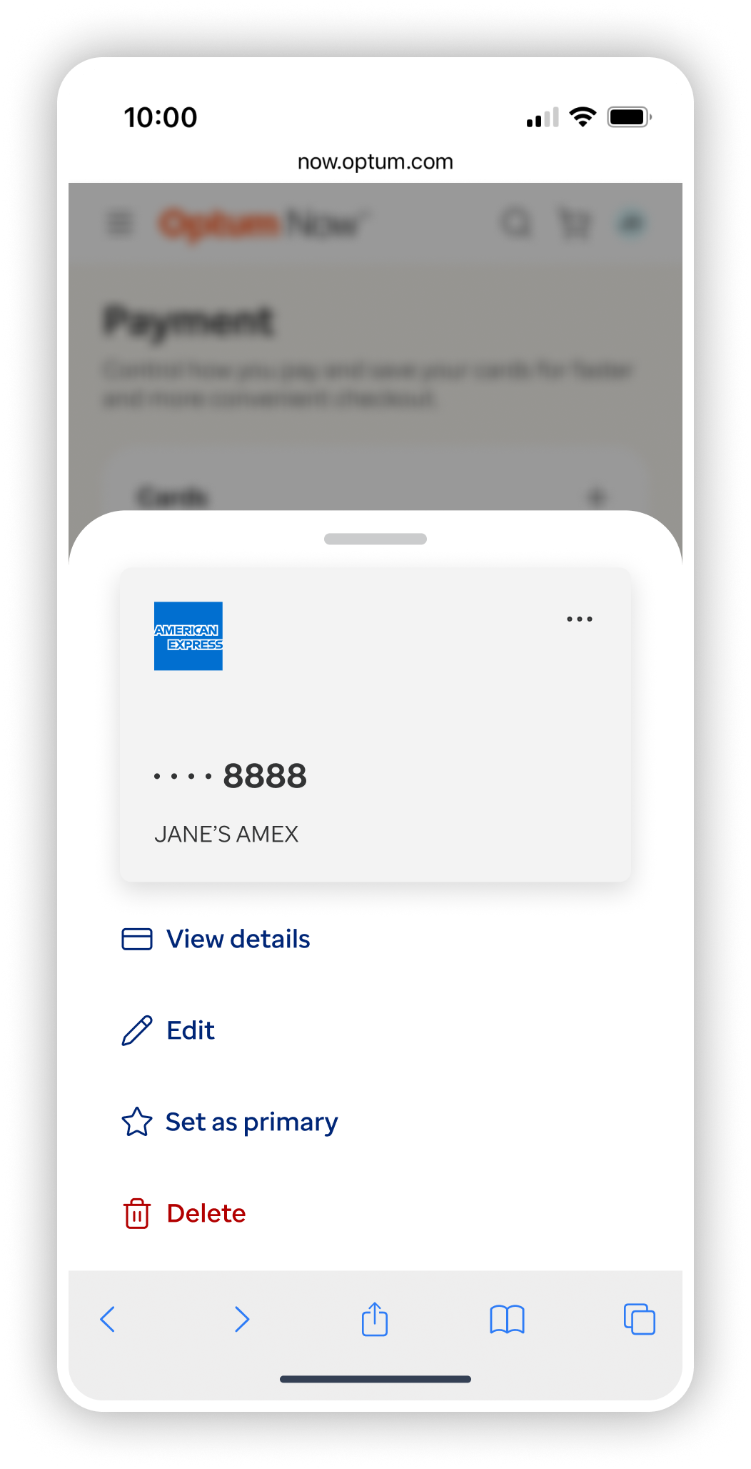
PAYMENT & ORDERS
A user can add and update methods of payment as well as view the status of upcoming and previous orders.


SAVED
A user can save, view, and share content from their profile.


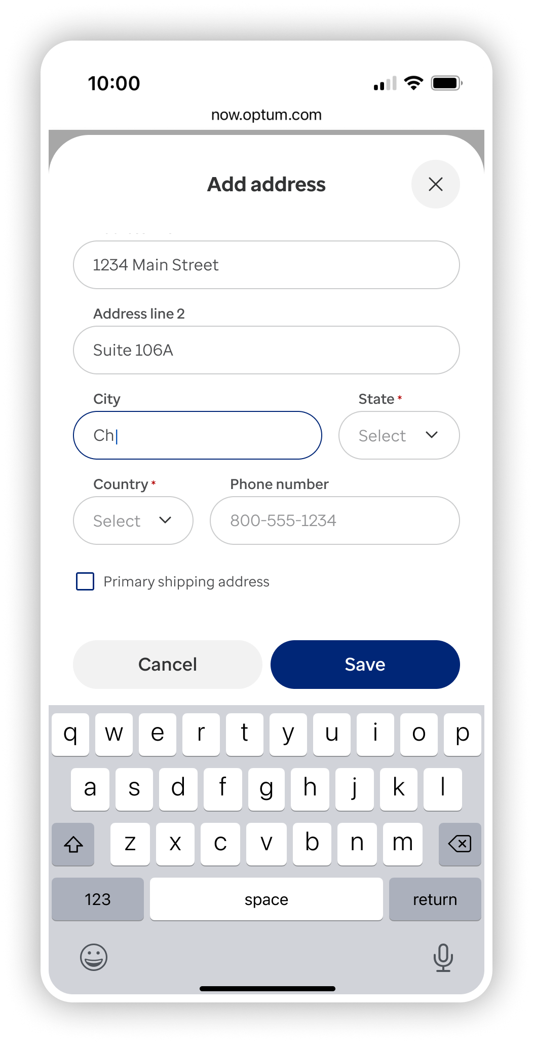
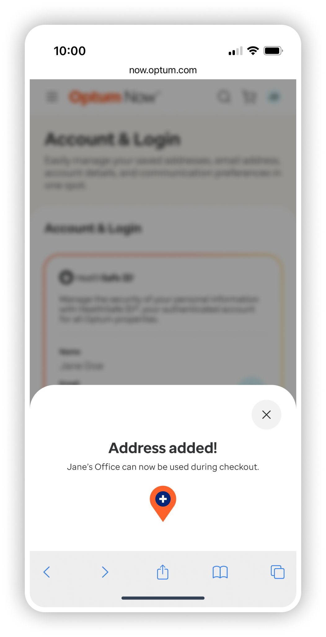
ACCOUNT & LOGIN
A user can access and update their login and account information as well as set default delivery address and notification preferences.


APPENDIX
Select an image to expand.
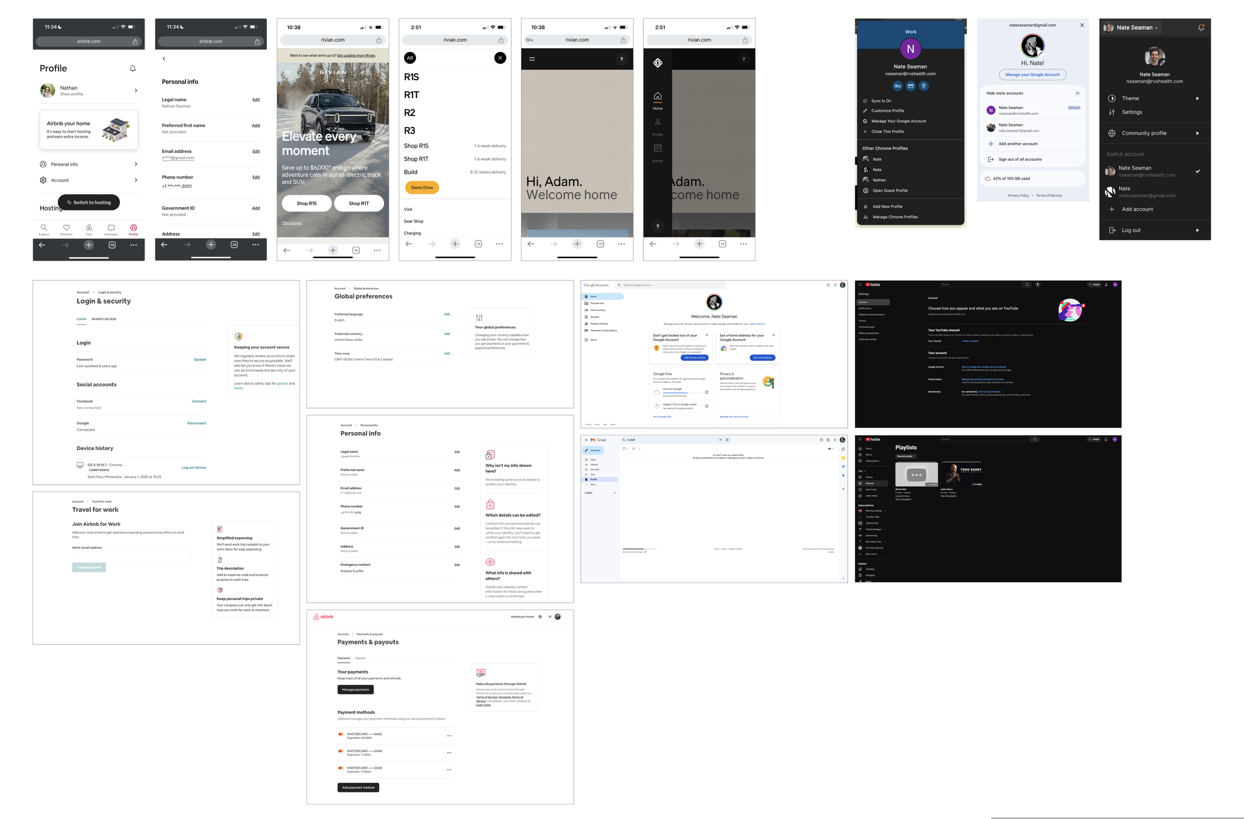
FIG. 1 Competitive analysis

FIG. 2.1 Previous, third party-owned experience
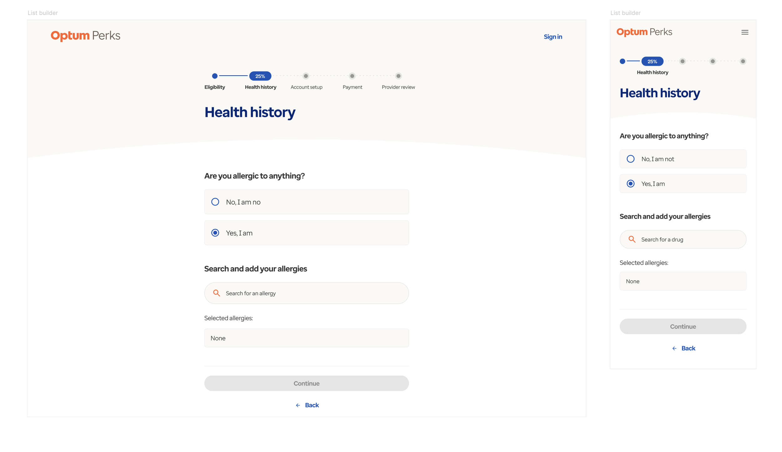
FIG. 2.2 Previous, third party-owned experience (detail of FIG. #.1)

FIG 3.1 Flow & UI ideation (account nav)
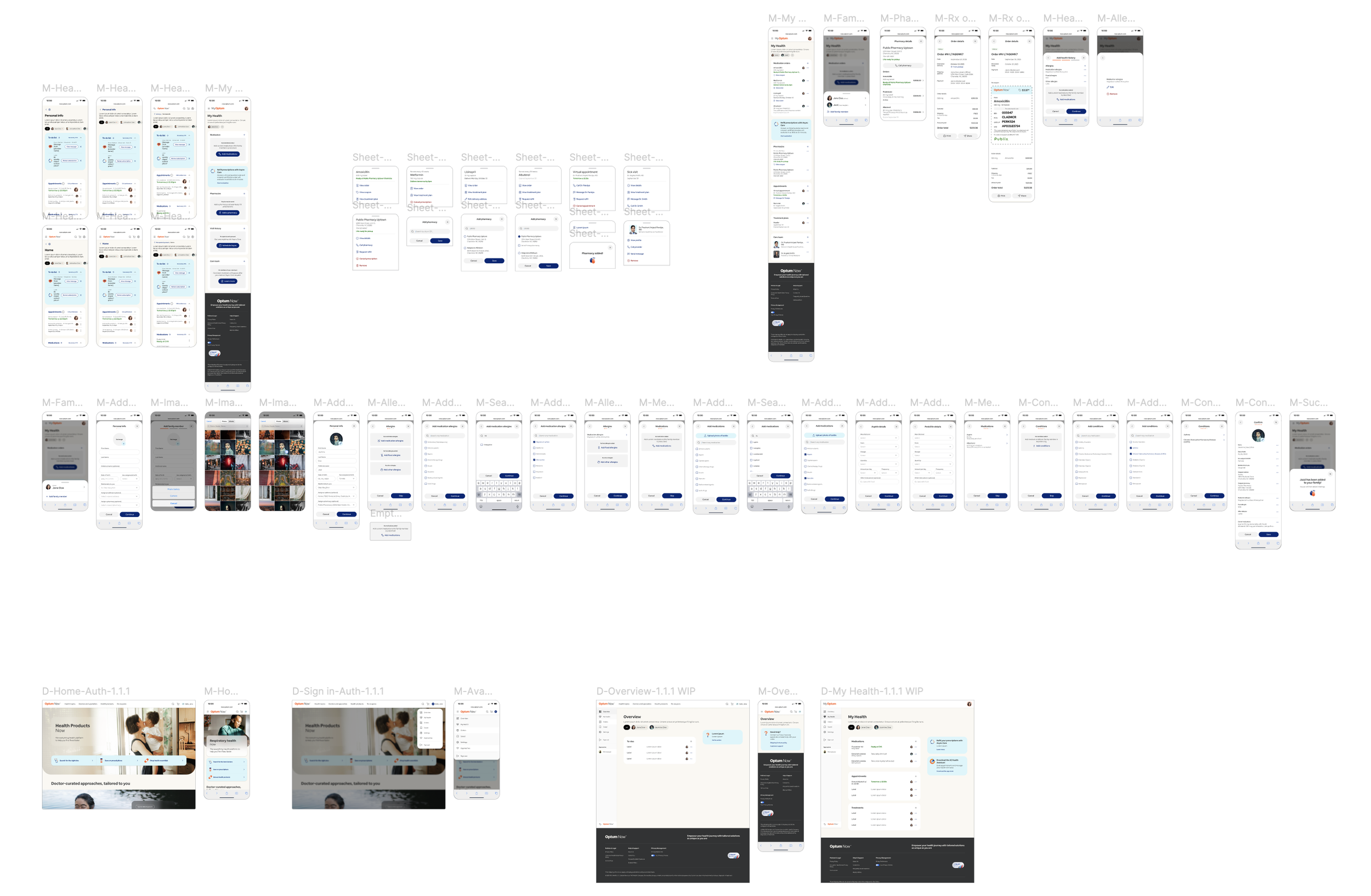
FIG. 3.2 Flow & UI ideation (add family member/health info)
FIG. 4 Select an avatar staging (deprioritized)
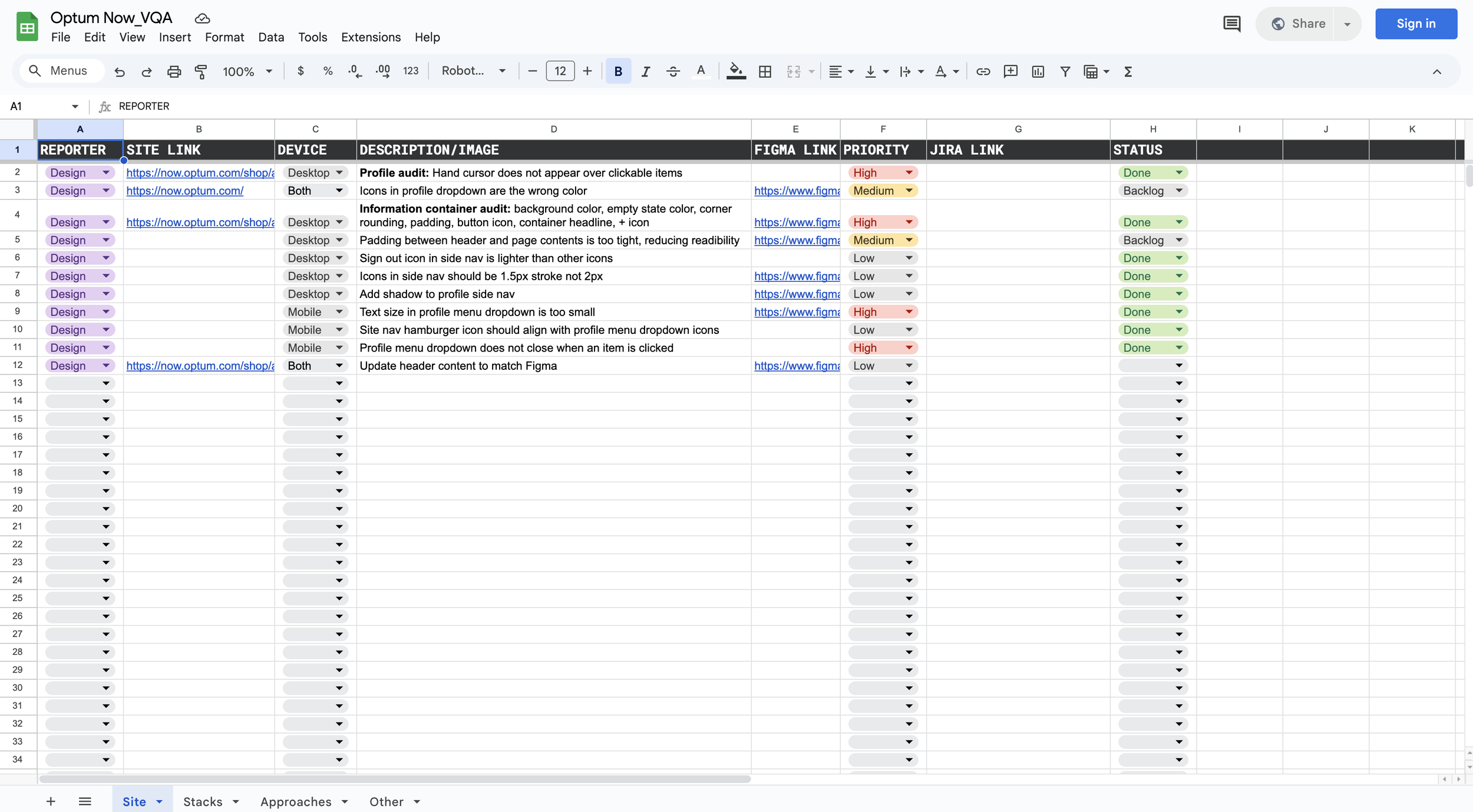
FIG. 5 VQA documentation